
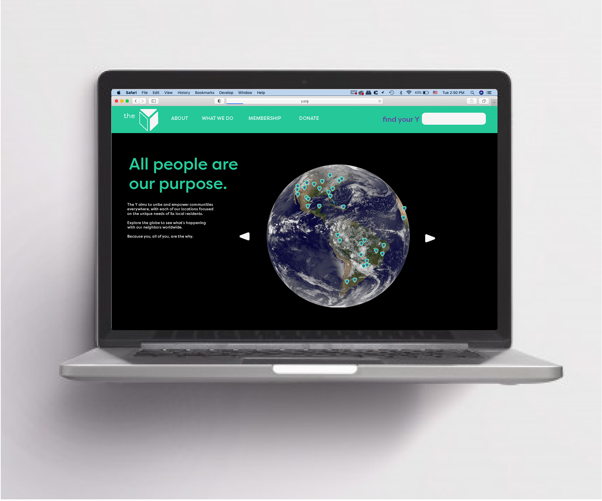
The YMCA is a non-profit rec center with branches all over the world. Each branch works closely with people of all sorts in its local community, but its current name (Young Men's Christian Association) implies that they are more geared toward men and religious people, and the brand identity fails to reflect its local impact.
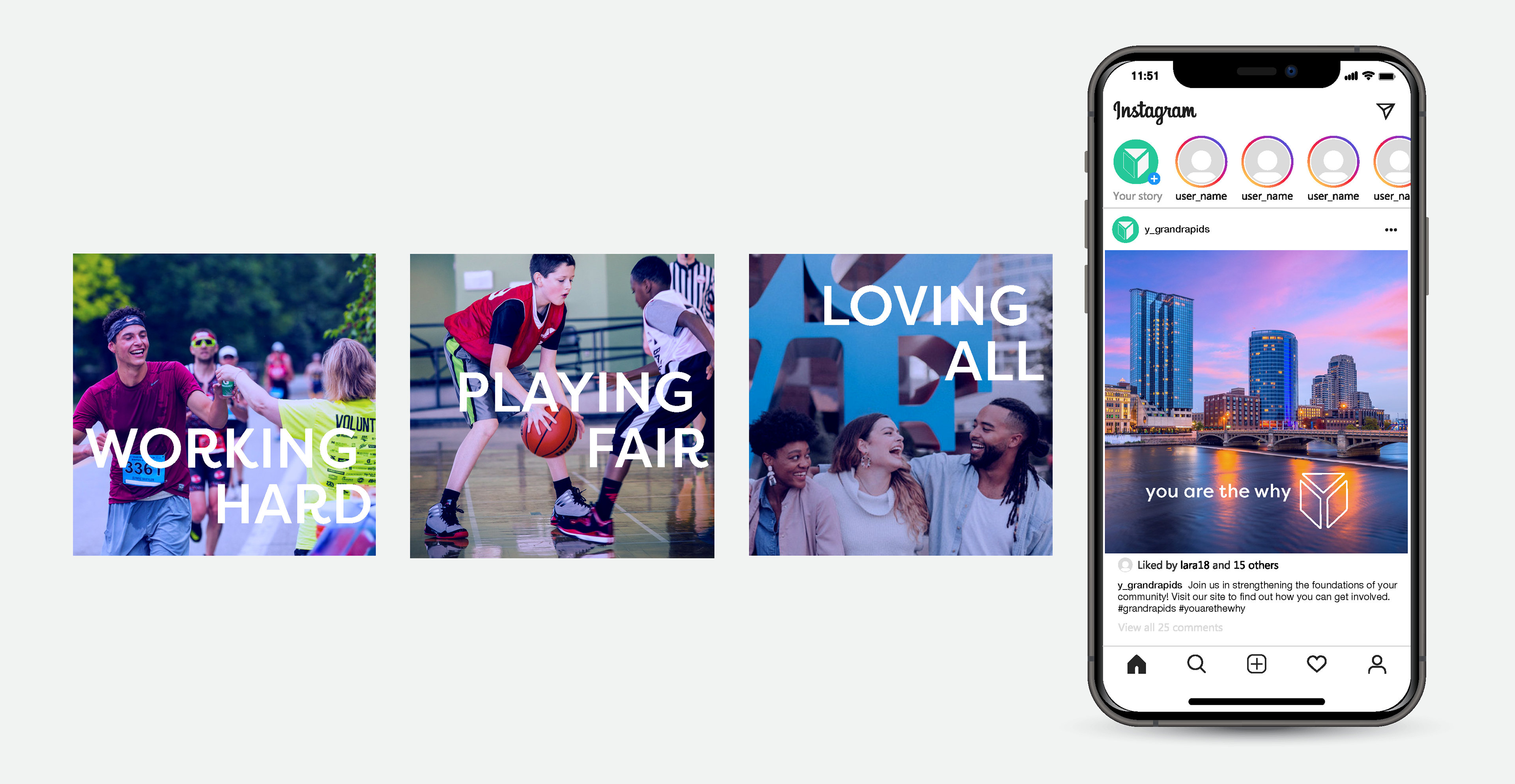
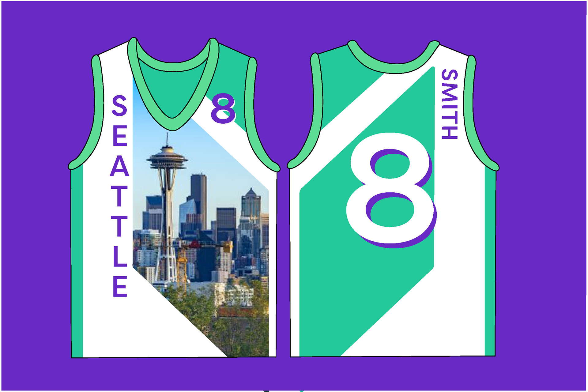
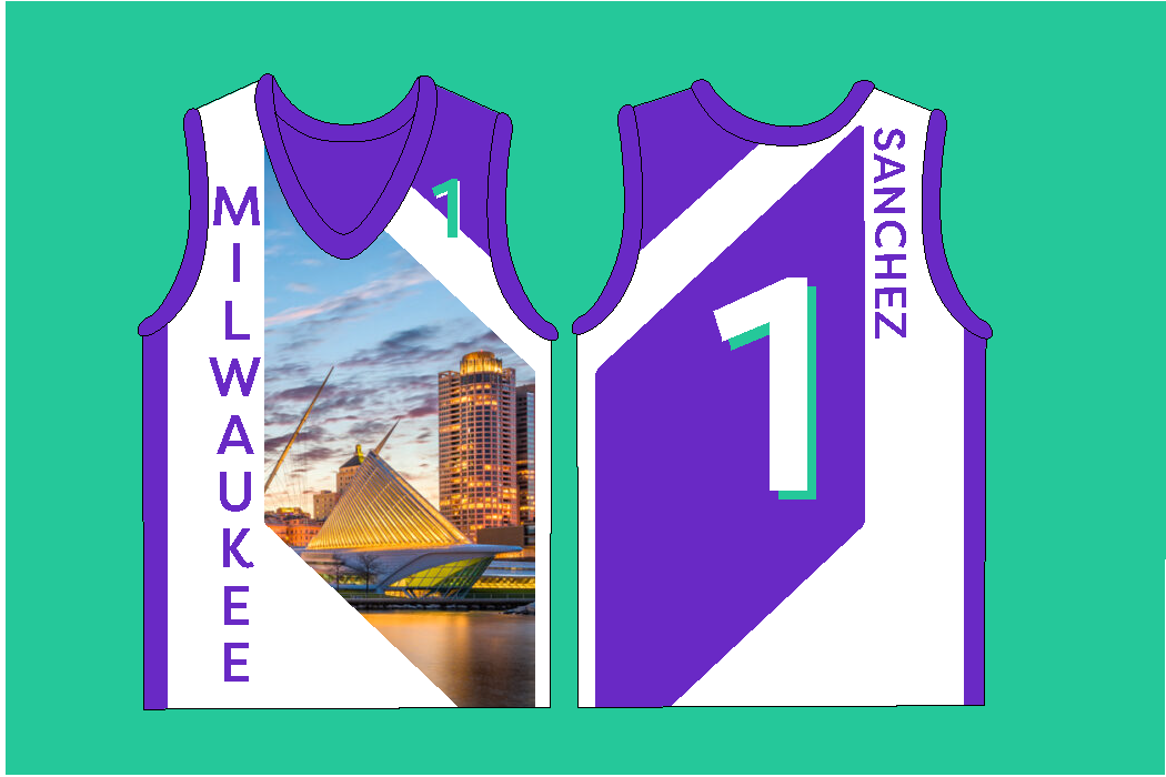
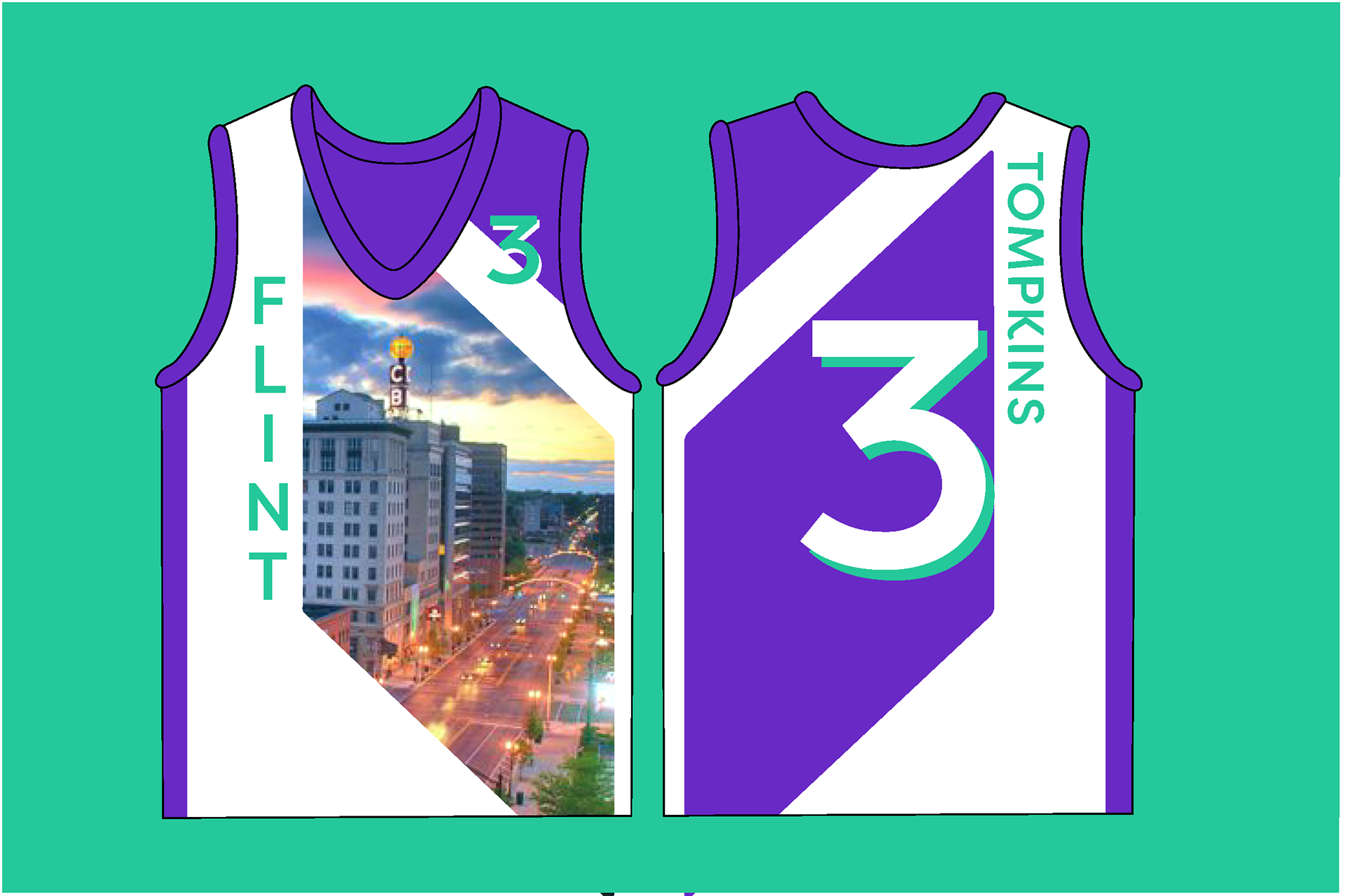
So in this brand refresh, the name was shortened to simply the Y. Each branch has its own variation of identity with imagery of its home community, sourced from local photographers. Different languages from the most prominent cultures in that area are used interchangeably in outdoor advertising and internal signage, personally welcoming any community member who may come across it.
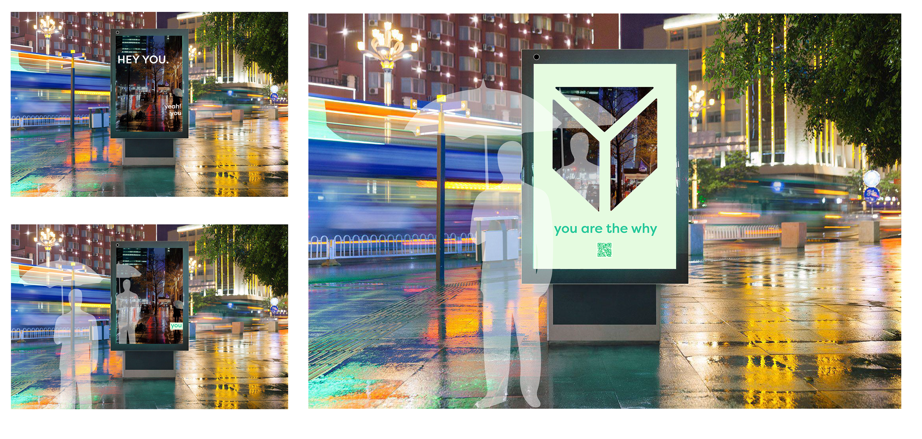
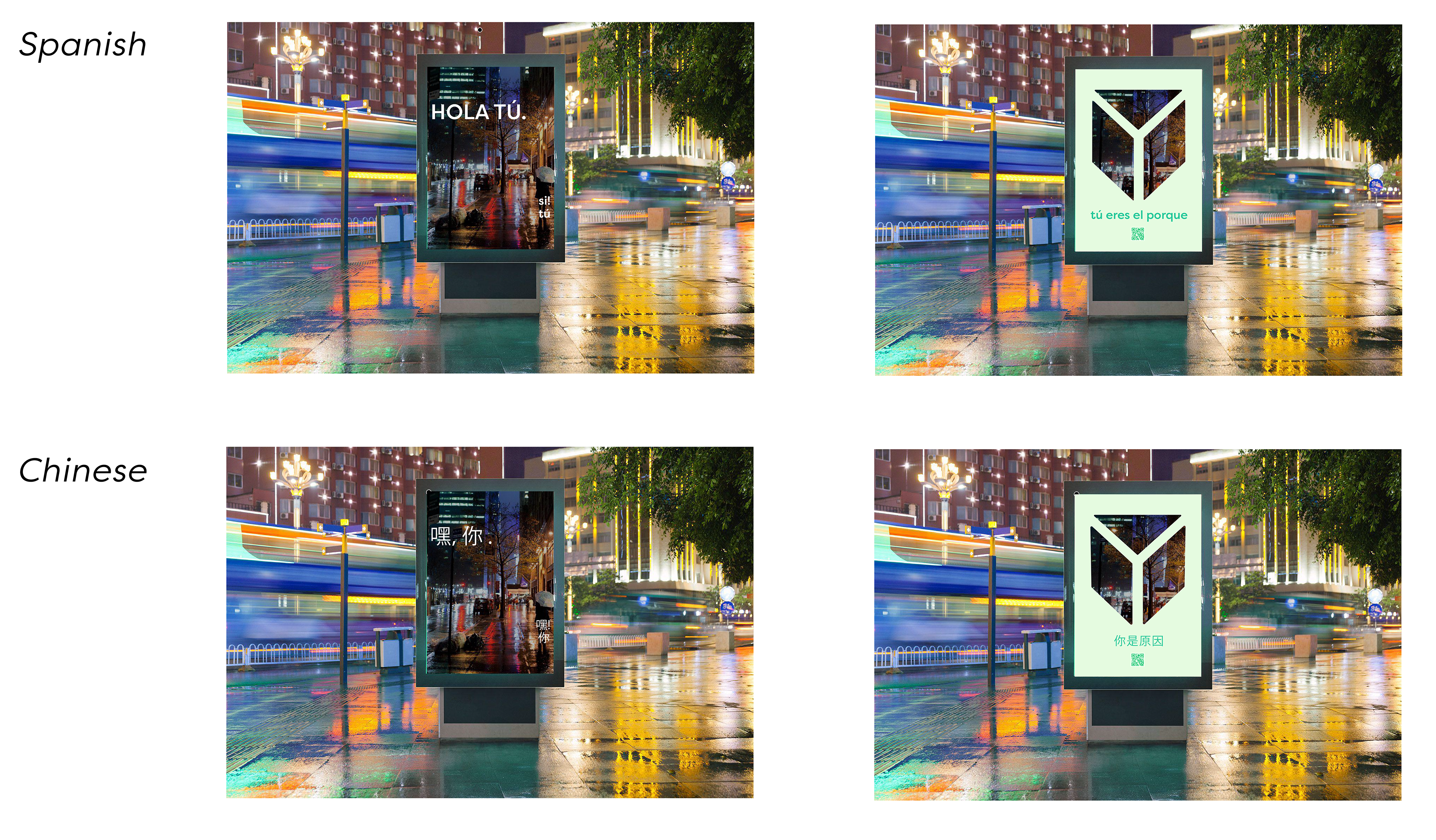
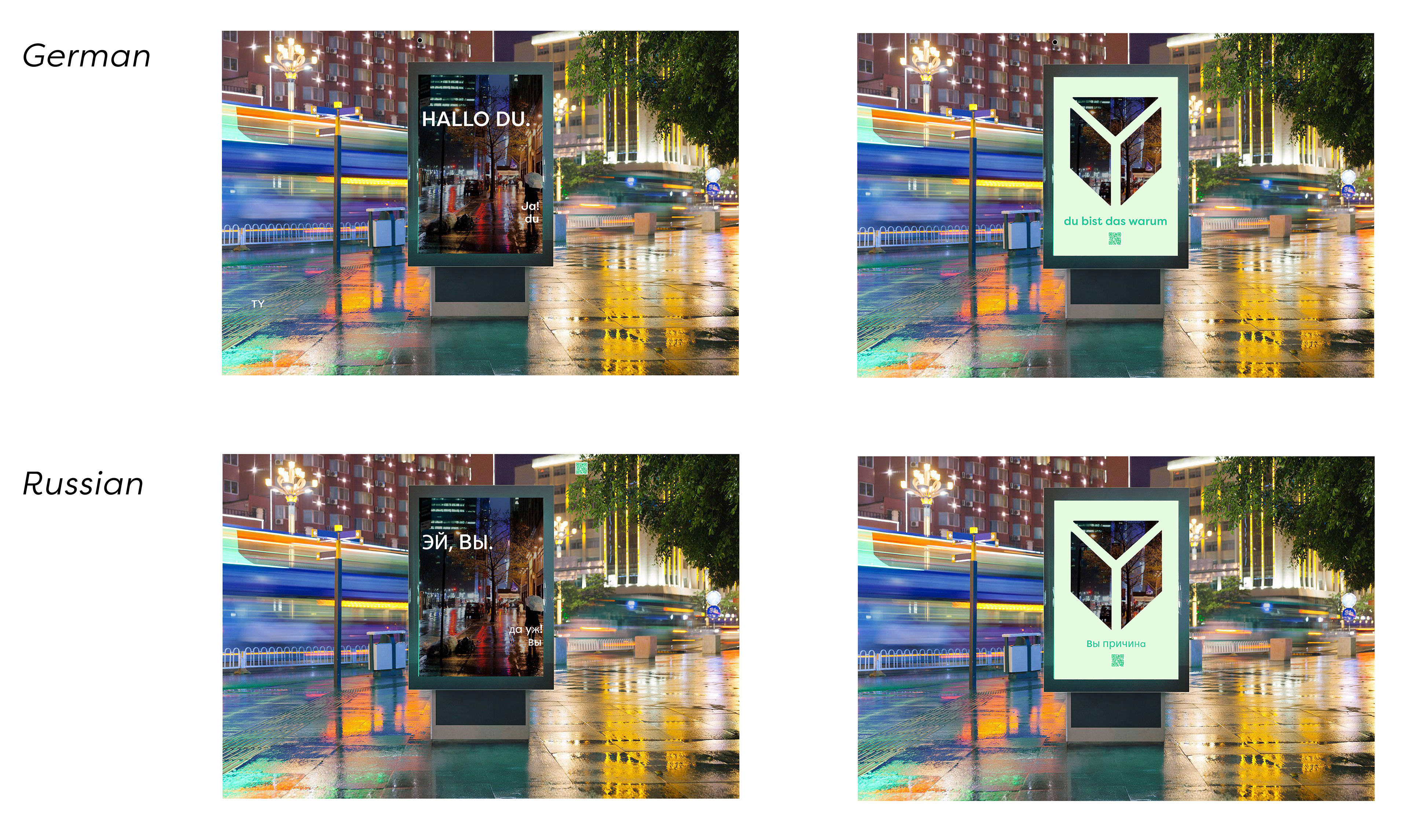
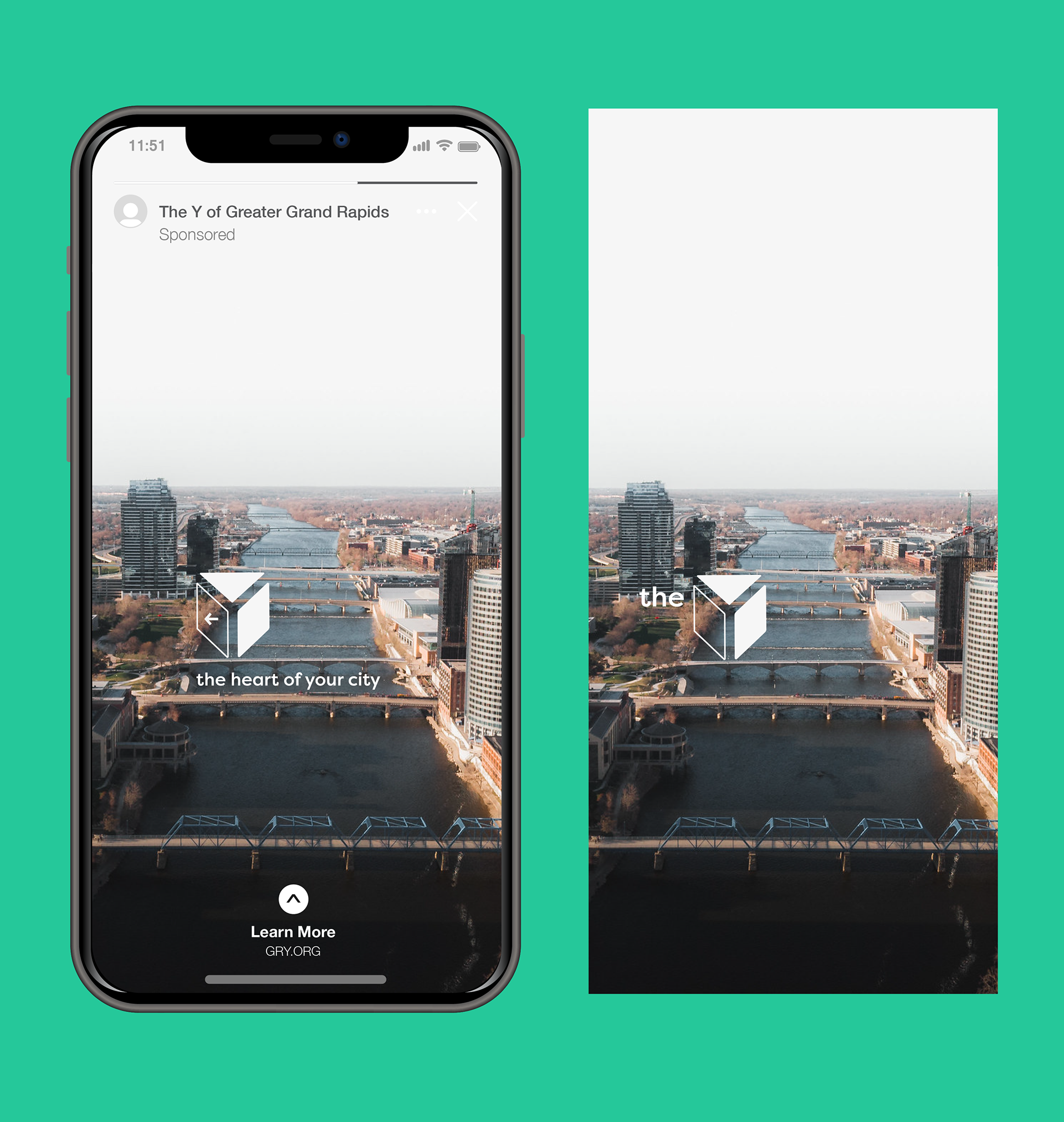
ANIMATED PEDESTRIAN BILLBOARD: “Hey you, yeah! you” appears over a screen with a camera reflecting the environment. As the viewer comes closer, “you are the why” slides in through the left, and the logo drops in, framing the viewer as the “why”.
The animation cycles through the phrase in a number of languages spoken within that community.
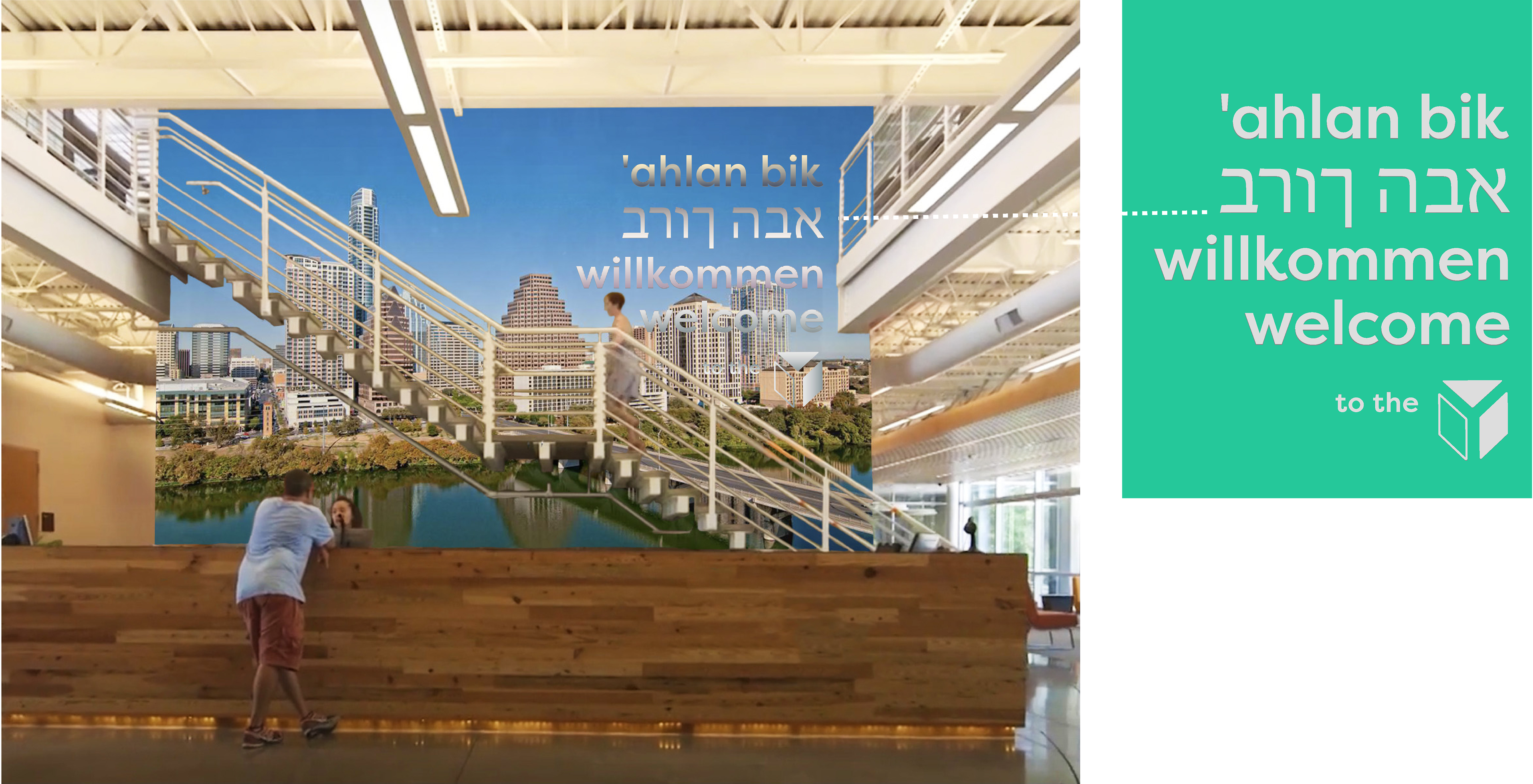
INTERNAL SIGNAGE: Each branch of the Y is equipped with large-scale photography of its city as wallpaper, and mirrored letters to spell “welcome” in a variety of languages spoken by the communities who live there.
Applied in the lobby, these create a sense of home and belonging for any local.